Social Media Image Sizes - The Complete Guide
Confused about social media image sizes? This complete guide covers the ideal dimensions for posts, stories, ads, and more, so your visuals always look their best.
Social media is hands down one of the best tools for brand engagement. So much so that 44% of local businesses count on it to build brand awareness. It’s dynamic, interactive, and, when done right, incredibly effective.
But let’s be honest. Success on social media takes more than just witty captions and the perfect mix of hashtags. One detail that gets overlooked way too often is Sizing requirements.
I can’t tell you how many times I’ve seen a great graphic completely ruined because it got cropped in all the wrong places or stretched into a pixelated mess. It’s like every social platform is that one overly strict art teacher who insists your work fits their exact dimensions. And just when you think you’ve got it figured out, an update changes everything.
Wouldn’t it be nice if all platforms just used one standard size? Yeah, not happening.
But that’s why I’ve put together this guide to save you from the constant resizing struggle. I’ll break down the latest sizing specs for top platforms, plus share some tips to make sure your visuals always look sharp no matter where you’re posting.
Let’s get into it.
What are Social Media Assets?
Your social media assets are essentially the digital fingerprints of your brand. From the moment you created your first profile, you started building them, whether you realized it or not. Every post, image, video, and even the smallest design element contributes to the overall impression you leave on your audience.
These assets fall into two main categories: text and visuals. While text-based content like captions, tweets, and bios play a crucial role in brand communication, visuals are what truly capture attention and create a lasting impression. Since each platform has its own set of rules for how content should be displayed, it’s important to understand what works where.
For now, let’s focus on visual assets. These are the building blocks of a strong brand presence on social media. They include everything from profile pictures and cover photos to posts, stories, carousels, and ads.
More than just eye candy; they help shape your brand’s identity and make it instantly recognizable in a sea of content. When used strategically, visual assets don’t just stop the scroll. They create a cohesive and memorable brand experience across platforms.
Types of Visual Social Media Assets
Visual assets play a huge role in how people perceive and engage with your brand. Each type serves a different purpose, but they all work together to create a cohesive, recognizable presence. Let’s break them down.
Profile Image
Your profile image is the face of your brand. It’s often the first thing people see, so it needs to be clear, recognizable, and consistent across platforms. Whether it’s a logo, a personal headshot, or a symbol that represents your brand, it should instantly convey who you are. Think of it as your digital handshake, it sets the tone for how people perceive your brand at a glance.
Cover Photos
Your cover photo gives you a larger visual space to make an impact. While your profile picture is fixed and minimal, cover photos give you room to showcase campaigns, promotions, events, or any brand updates you want to highlight. Since they’re the biggest visual element on your profile, they should align with your branding and be updated periodically to stay relevant.
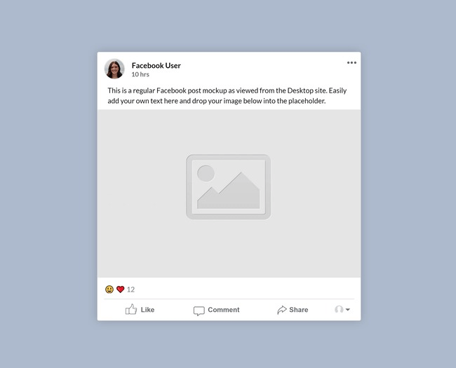
Post Images
Post images are the visuals that accompany your regular posts and updates. These can be standalone graphics or images paired with text to reinforce your message and improve engagement.
Visual posts tend to be more memorable and eye-catching than plain text, making them an effective way to grab attention as people scroll through their feeds. To maximize their impact, keep your brand colors, fonts, and style consistent, but don’t be afraid to experiment with different formats and styles to see what resonates with your audience.
Shared Link Images
These are the images that preview shared links, whether it’s a product page, blog post, or external resource. A good shared link image should capture the essence of the linked content, provide context, and make people want to click. Think of it as a teaser that gives just enough information to spark curiosity. Also known as ‘link previews’.

Infographics
Infographics take complex information and break it down into a visually digestible, easy-to-remember format. Whether it’s data, step-by-step processes, industry insights, or how-to guides, infographics help turn dense information into something engaging and shareable. From product user guides to educational content, they’re a great way to communicate value quickly.
Memes
Memes are the ultimate engagement drivers. They add humor, relatability, and personality to your brand. A well-placed meme can humanize your brand, make your audience laugh, and encourage shares.
That said, humor is subjective. Not every meme will land well, so make sure yours aligns with your brand voice, values, and audience interests. Also, keep them culturally relevant and steer clear of anything that could be misinterpreted.
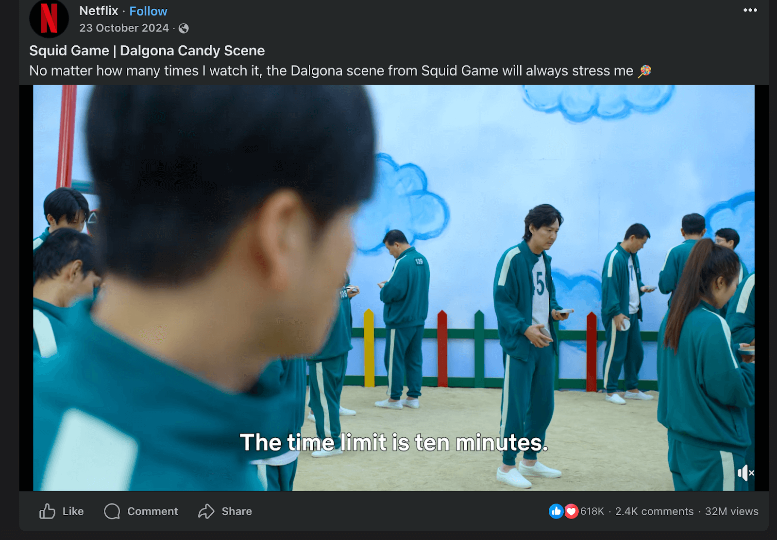
Videos
Videos are one of the most engaging content formats across social media. Whether it’s tutorials, behind-the-scenes clips, product showcases, event coverage, or promotional content, a well-crafted video can significantly increase engagement and brand recall.
To make the most of your videos, keep them concise, dynamic, and aligned with your brand messaging. Use captions for accessibility and optimize them for each platform’s preferred format.
Thumbnails
Thumbnails are the preview images for larger content pieces like videos, e-books, or whitepapers. They might seem small, but they play a huge role in whether someone decides to click or not.
A strong thumbnail should be clear, visually striking, and relevant to the content. Use bold visuals, minimal but impactful text, and high-contrast colors to make it stand out in a crowded feed.
➡️Pro tip: TestMyThumbnails helps YouTube and video creators optimize their video thumbnails by simulating how they appear in real YouTube feeds, enabling data-driven decisions for better visibility and click-through rates.
Product Photos
If you’re selling a product, high-quality product images are non-negotiable. They should showcase your product in the best light while also telling a story about how it fits into your customers’ lives.
Lifestyle images, where your product is shown in real-world use, helps potential buyers visualize themselves using it. Encourage user-generated content by featuring customer photos and testimonials, as this builds trust and credibility while keeping your content fresh and authentic.
Post Images
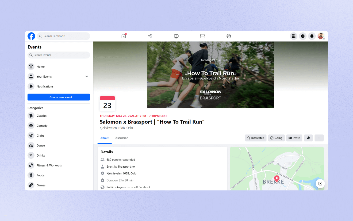
Your post images are your daily bread on Facebook, whether you’re sharing updates, promotions, or just keeping your audience engaged. They need to be clear, high-quality, and properly scaled to avoid awkward cropping or pixelation.
- Recommended Size: 1200 x 630 pixels
- Minimum Size: 600 x 315 pixels
- Aspect Ratio: 1.91:1
- Supported Formats: JPG, PNG
- Maximum File Size: 30MB
💡 Pro Tip: Always upload images in the highest resolution possible without exceeding file size limits. A higher resolution ensures that your content remains sharp across different devices and screen sizes.
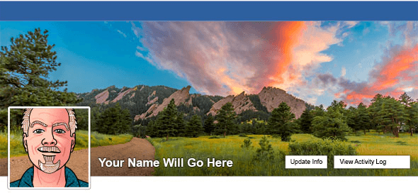
Cover Photo
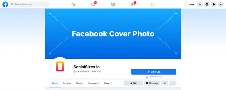
Your cover photo is like the welcome mat of your Facebook page, it sets the tone for visitors. It’s also one of the biggest visuals on your profile, so it needs to be strategic, high-resolution, and well-balanced.
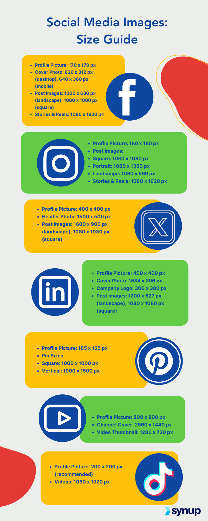
- Desktop Dimensions: 820 x 312 pixels
- Mobile Dimensions: 640 x 360 pixels
- Safe Zone: Keep all important elements within 560 x 312 pixels to avoid them getting cut off on different screens.
- Supported Formats: JPG, PNG
- Max File Size: 100KB (smaller file sizes load faster)
💡 Profile pictures overlap cover photos slightly, especially on mobile. Avoid placing key elements like text or faces near the bottom left corner, as they may get covered.
Profile Picture

This is your brand’s digital face. Whether it’s your logo or a headshot, your profile picture needs to be clear, recognizable, and consistent across platforms.
- Desktop Display: 170 x 170 pixels
- Mobile Display: 128 x 128 pixels
- Minimum Upload Size: 180 x 180 pixels
- Shape: Circular frame (even though you upload a square image, the edges will be cropped)
💡 To keep your branding intact, ensure your logo or key elements are centered, avoiding the edges where cropping occurs.

Ad Image Sizes
Facebook ads come in various formats, but thankfully, the platform has standardized most image ad dimensions.
- Single Image Ads: 1080 x 1080 pixels (1:1 aspect ratio)
- Carousel Ads: 1080 x 1080 pixels (1:1 aspect ratio, supports multiple images)
- Right Column Ads: 1200 x 1200 pixels (1:1 aspect ratio, mostly desktop view)
- Story Ads: 1080 x 1920 pixels (9:16 aspect ratio, full-screen mobile format)
Always keep 20% or less text on images to avoid reduced reach. Facebook prioritizes ads that are visually clean and engaging over text-heavy creatives.
Event Cover Photo
Hosting an event? Your event cover photo should be bold, eye-catching, and informative. It’s the first thing people notice when they check out your event page.
- Ideal Size: 1200 x 628 pixels
- Aspect Ratio: 2:1
💡Since event covers display differently across devices, keep all text and important visuals centered to prevent cropping on mobile screens.

Group Cover Photo
If you run a Facebook group, the group cover photo is your visual first impression. Since groups are often community-driven, this is your chance to establish a strong identity.
- Recommended Size: 1640 x 856 pixels
- Aspect Ratio: 1.91:1
💡 Facebook automatically adjusts group covers based on different screen sizes. Always preview your image on both desktop and mobile to ensure nothing important gets cut off.
Video Specifications
Video content dominates Facebook. Whether you’re sharing tutorials, product launches, or behind-the-scenes clips, your video dimensions play a big role in engagement.
- Recommended Aspect Ratios: 16:9, 1:1, 4:5, 9:16 (depends on format)
- Minimum Resolution: 720p (higher is always better)
- Maximum File Size: 4GB
- Maximum Length: 240 minutes
- Supported Formats: MP4, MOV
💡 Square (1:1) and vertical (9:16) videos perform better for mobile viewers, while landscape (16:9) works best for desktop. Optimize your videos based on where your audience engages the most.
X (Formerly Twitter)
The audience here is wired for quick consumption, rapid engagement, and instant reactions. Unlike other platforms where people may linger on a post, Twitter thrives on bite-sized content that makes an impact in seconds.
This means your visuals have to work overtime to grab attention, stand out in a cluttered feed, and communicate your message immediately. Whether it’s a profile picture, header image, tweet graphic, or video, knowing the right dimensions ensures your content remains crisp, well-structured, and visually compelling across devices.
So, let’s break it down one asset at a time.
Profile Image
Your profile picture is your brand’s digital identity. It’s what appears next to your tweets, replies, and even in notifications. A poorly cropped or blurry profile image can weaken credibility, while a sharp, well-centered one makes you instantly recognizable.
- Recommended Size: 400 x 400 pixels
- Minimum Size: 200 x 200 pixels
- Aspect Ratio: 1:1 (Square, but displayed in a circular frame)
- Maximum File Size: 2MB
- Supported Formats: JPG, PNG
💡 Since Twitter crops profile pictures into a circular frame, make sure the most important elements, like your logo or face, are centered to prevent anything from getting cut off.
Header Image
Your header image is prime real estate. It’s the biggest visual on your profile and a great opportunity to reinforce your branding, highlight promotions, or showcase a mission statement.
- Recommended Size: 1500 x 500 pixels
- Aspect Ratio: 3:1
- Maximum File Size: 5MB
- Supported Formats: JPG, PNG
Here are some things to consider:
❌Your profile picture overlaps the header image slightly, so avoid placing critical design elements in that area.
✅Twitter displays headers differently across devices, sometimes cropping the edges. Keep text and key visuals toward the center to maintain readability on mobile and desktop.
Tweet Image Size
Tweets with images get 3x more engagement than plain text tweets. But, not all images are displayed the same way. You want to ensure your graphics are well-sized, properly cropped, and engaging even in preview mode.
- Recommended Size: 1200 x 675 pixels
- Minimum Size: 600 x 335 pixels
- Aspect Ratio: 16:9
- Maximum File Size: 5MB
- Supported Formats: JPG, PNG, GIF
✔ Use bright, high-contrast colors to stand out in a fast-moving feed.
✔ Add minimal but impactful text. Twitter crops images in previews, so keep important words in the center.
✔ If you’re posting multiple images, Twitter lays them out in a grid, test how your images will be displayed before posting.
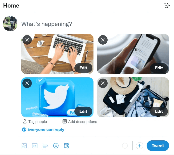
Multi-Image Tweets
Sometimes, one image isn’t enough. If you’re posting multiple images in a single tweet, Twitter arranges them differently based on the number of images.
- 2 Images: Both displayed side by side (700 x 800 pixels recommended).
- 3 Images: One large image on the left, two smaller images stacked on the right (700 x 800 pixels for the left image, 1200 x 600 pixels for the right images).
- 4 Images: Arranged in a 2x2 grid (1200 x 600 pixels per image).
Multi-Image Posting Tips:
- Test layouts before posting, some crops can be unexpected.
- Make sure your branding or main subject isn’t cut off in the preview.
- Keep a consistent theme across all images for a cohesive look.
GIFs on Twitter
GIFs are a game-changer for engagement. They’re eye-catching, loop continuously, and require zero effort from the user. Whether you’re responding with a reaction GIF or sharing branded animations, they should be optimized for quality.
- Maximum File Size: 5MB (Mobile), 15MB (Web)
- Recommended Dimensions: 1280 x 720 pixels
- Frame Rate: Up to 40fps
- Supported Formats: GIF
Why GIFs Work:
✔ They add motion to a fast-moving feed.
✔ They work well for storytelling, tutorials, and humor.
✔ They autoplay, making them instantly eye-catching.
Twitter Video
Videos on Twitter autoplay as users scroll, making them one of the most engaging formats. But if your video isn’t sized properly, it can appear blurry, cropped, or awkwardly framed.
- Recommended Aspect Ratios: 16:9 (Landscape), 1:1 (Square), 9:16 (Vertical)
- Minimum Resolution: 720 x 720 pixels
- Maximum Resolution: 1920 x 1080 pixels
- Maximum Length: 2 minutes 20 seconds (140 seconds)
- Maximum File Size: 512MB
- Supported Formats: MP4, MOV (H.264 and AAC codecs recommended)
✔ Make the first 3 seconds count. Twitter videos autoplay, but users need a reason to keep watching.
✔ Keep it short and engaging. The sweet spot for engagement is 15–45 seconds.
✔ Add captions! 85% of Twitter users watch videos without sound. Captions keep them engaged.
Twitter Ads
If you're running Twitter ads, image and video quality is non-negotiable. Poorly formatted visuals can lead to low engagement and wasted ad spend.
Image Ads
- Recommended Size: 1200 x 1200 pixels (1:1) or 1200 x 628 pixels (1.91:1)
- Maximum File Size: 3MB
- Formats: JPG, PNG
Video Ads
- Aspect Ratios: 16:9, 1:1, 9:16
- Resolution: Minimum 720p, Maximum 1080p
- Length: Up to 2 minutes 20 seconds
- Formats: MP4, MOV
✔ Use short, snappy copy, Twitter is all about quick messaging.
✔ A/B test different formats to see what resonates with your audience.
✔ Make sure your ad looks great on both desktop and mobile.
Instagram is all about visual storytelling, and if your content isn’t optimized for the platform’s dimensions, it can get cropped, compressed, or just not hit as hard as you’d like. Whether you’re posting a single image, a carousel, a Reel, or an IGTV video, getting the sizing right ensures your content looks sharp, professional, and engaging.
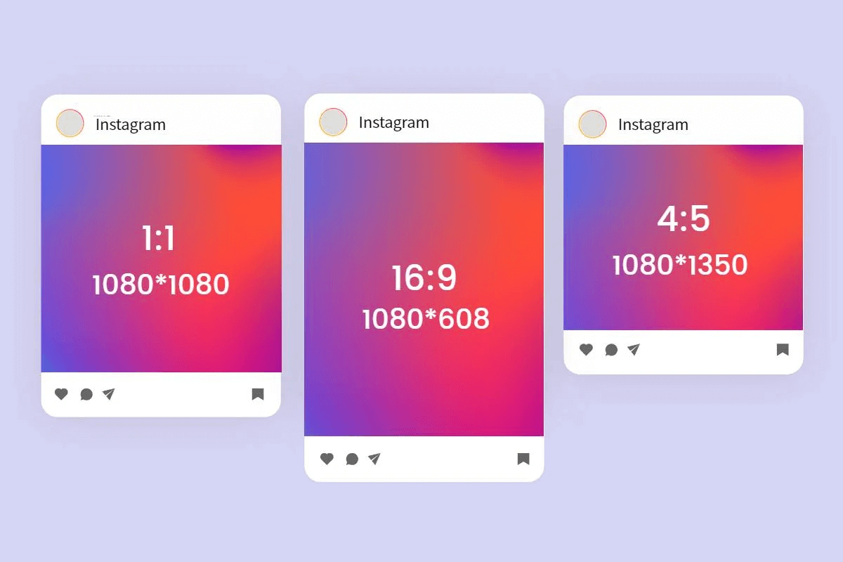
Instagram Post Sizes
You’ve got options when it comes to feed posts, but each format has its own best practices:
- Square Posts: The classic 1:1 aspect ratio. Use 1080 x 1080 pixels for high quality. These display well across devices and work great for balanced compositions.
- Portrait Posts: A vertical format with an optimal size of 1080 x 1350 pixels. This format takes up more screen space while scrolling, making it ideal for showcasing details.
- Landscape Posts: A wider format best for panoramic shots. Stick to 1080 x 608 pixels to maintain clarity. Instagram allows wider images, but they’ll get compressed on the feed.
⚡ No matter which format you choose, Instagram scales images down to 600 x 600 pixels (square), 600 x 750 pixels (portrait), and 600 x 315 pixels (landscape) for display. So, always upload at the highest recommended resolution to avoid pixelation.
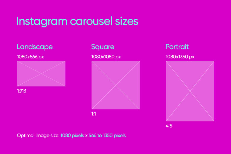
Instagram Carousel Sizes
Carousels allow you to post up to 10 images or videos in a swipeable format. The same dimensions apply as regular posts:
- Square: 1080 x 1080 pixels
- Portrait: 1080 x 1350 pixels
- Landscape: 1080 x 566 pixels
All carousel slides should maintain the same aspect ratio, or Instagram will crop them to match the first image.
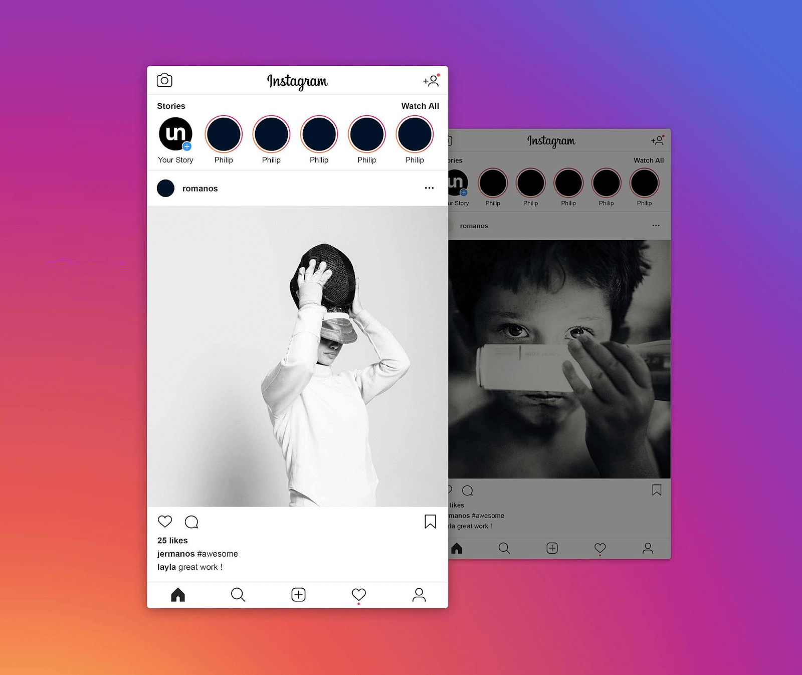
Instagram Stories
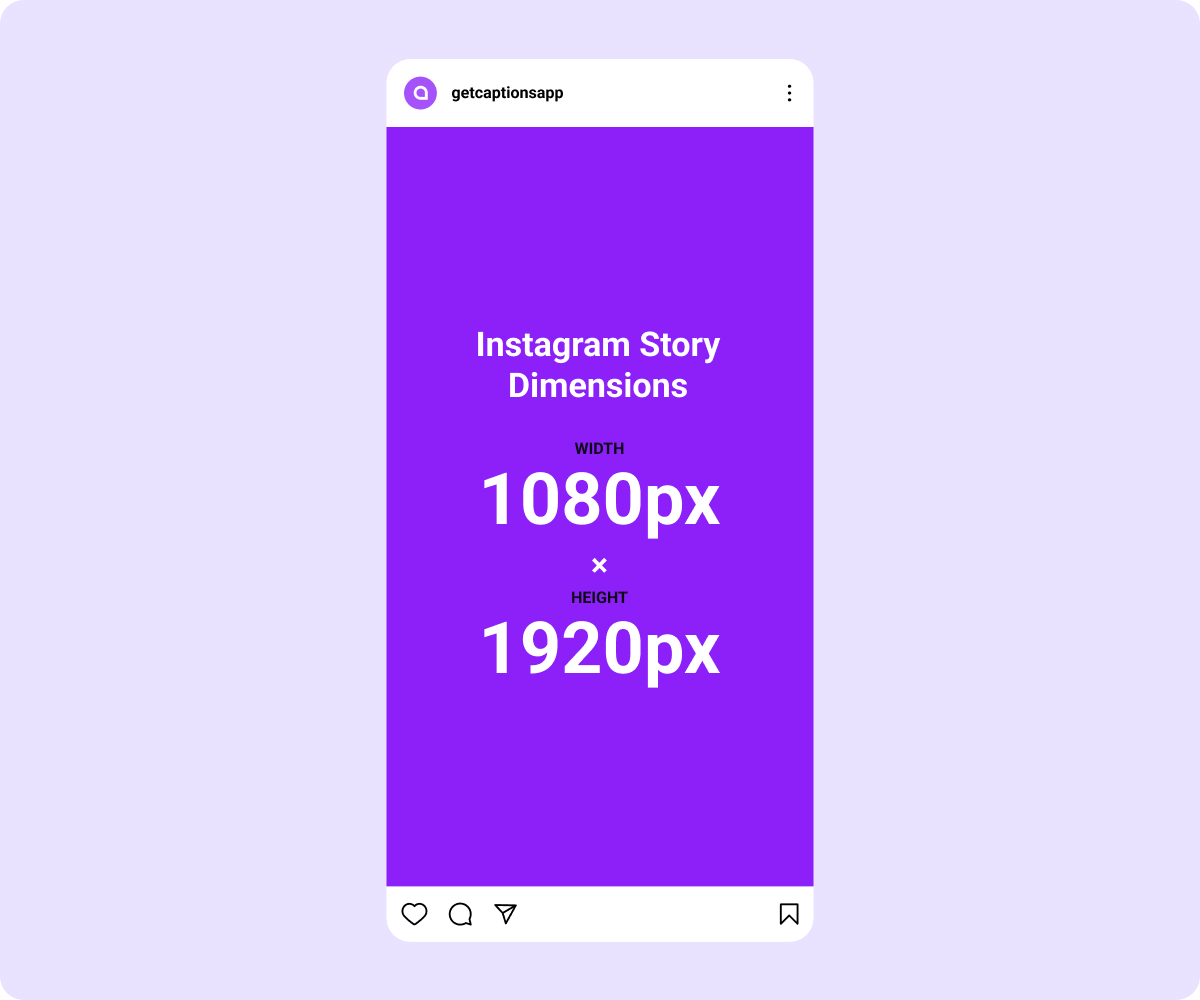
Stories demand a 9:16 aspect ratio, which means a recommended size of 1080 x 1920 pixels. This format fills the entire phone screen, making it perfect for immersive content.
- Safe zone: Keep text and essential elements within the central 1080 x 1420 pixels to prevent cropping on different devices.
- File formats: JPEG or PNG for images, MP4 or MOV for videos.
- Max video length: Each Story frame can be up to 15 seconds long. If it’s longer, Instagram automatically splits it into multiple clips.
⚡Use interactive features like polls, questions, and stickers to keep engagement high.
Instagram Reels & IGTV
Reels and IGTV are all about video content, but they have slightly different specs:
- Reels: Vertical 1080 x 1920 pixels (9:16 aspect ratio).
- IGTV Videos:
- Cover photo: 420 x 654 pixels (keep text centered).
- Video aspect ratio: 9:16 (vertical) or 16:9 (horizontal).
- Max video length: 60 minutes for uploaded videos, but shorter videos (under 10 minutes) tend to perform better.
Instagram Profile Picture
Your profile picture might seem minor, but it’s a crucial branding element. Here’s what you need to know:
- Optimal size: 320 x 320 pixels (displays at 110 x 110 pixels).
- Format: Square images work best, but remember Instagram crops them into a circle. Keep important details in the center.
Instagram Ads Image Sizes
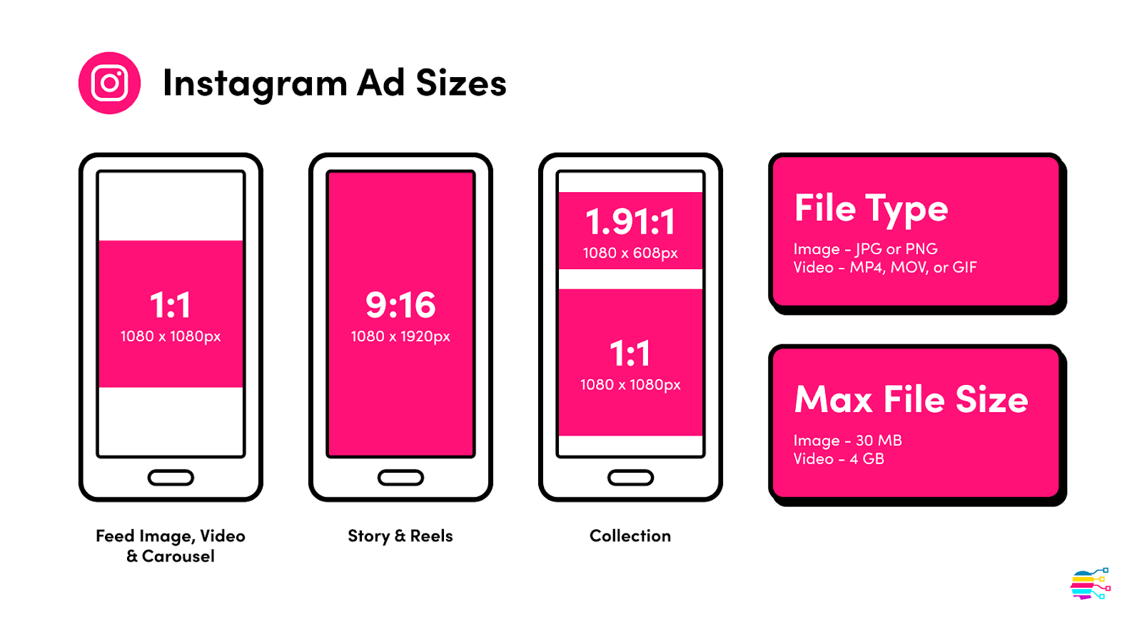
If you’re running ads, make sure they’re formatted correctly:
- Single Image & Carousel Ads: Follow the same size guides as regular posts.
- Story Ads: 1080 x 1920 pixels with a 4:5 safe zone to prevent cropping.
- Video Ads: Should follow the recommended 9:16 (vertical) or 4:5 (portrait) aspect ratios.
TikTok
TikTok's explosive rise as a short-form video giant has reshaped digital engagement. Today, TikTok is a trend-setting community that gives life to many internet trends. Understanding the intricacies of sizing and visual elements is critical to navigate this exhilarating space successfully.
Profile Images
The optimal image size for IG profile pictures is 200 x 200 pixels. And like other platforms, TikTok displays profile pictures in a circular format. Ensure the image is clear and consistent across all platforms.
Video Dimensions and Aspect Ratios
- TikTok’s vertical video aspect ratio of 9:16 has been magical and is one of the key reasons behind the platform’s phenomenal success. The ratio creates a more immersive viewing experience on mobile devices than almost any other ratio.
- When it comes to resolutions, TikTok isn’t picky. It supports various resolutions, but 1080 x 1920 pixels is the optimal resolution for high-quality content.
⚡️Using optimized image forms allows you to fully leverage TikTok's short-form video format for dynamic and engaging content. For more impact, utilize effects, transitions, and music to enhance viewer experience. Also, incorporate concise text overlays on videos to convey messages effectively.
⚡️Design eye-catching thumbnails to entice viewers. Use clear visuals and consider incorporating text or captions that hint at the content. Maintain a consistent thumbnail style for brand recognition.
⚡️Overall, stay current with TikTok trends to find out more ways to boost discoverability and engagement.
YouTube
On YouTube, thoughtfully crafted stories and captivating visuals are the order of the day.
As a colossal platform for video content, you can’t afford to flaunt sizing requirements if you want to stand out on YouTube.
Channel Art Dimensions
The optimal dimensions for YouTube channel art are 2560 x 1440 pixels. Note that this might not display fully across all devices. But there’s a “safe area” of 1546 x 423 within this standard dimension that’s sure to display on any device, so capitalize on this and make sure it captures the most important elements.
Video Upload
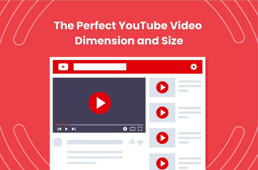
YouTube supports various resolutions, but for optimal quality, upload videos in 1080p (1920 x 1080 pixels) or higher. On the other end of the spectrum, you can’t go lower than 1280 x 720.
Use familiar colors, fonts, and layouts across your videos. Incorporate branding elements, logos, and a tagline to create visually cohesive branding. For seamless playback, utilize file formats like MP4.
Thumbnail Size
The recommended thumbnail size is 1280 x 720 pixels, just like the videos they represent. You can vary as you need, but you must maintain a 16:9 aspect ratio. Eye-catching thumbnails evoke curiosity. But don’t get too creative, make sure you accurately represent the video content. Experiment with different thumbnail styles and monitor their impact on click-through rates.
Professional networking on LinkedIn requires impactful content. However, poor formatting can blunt the impact of your LinkedIn content.
In a professional environment such as LinkedIn, your contacts will likely have an eye for professionally cut content. That means your image sizes speak volumes here, and measurement precision can help you elevate your brand content.

Post Images:
Optimal dimensions for images in LinkedIn posts are 1200 x 627 pixels. Try not to get too creative with your LinkedIn post images. Strive for clarity and professionalism for enhanced engagement.
Banner Images:
For profile banners, use images with dimensions of 1584 x 396 pixels. Don’t forget to make sure that the banner complements your professional brand.
Company Page:
Maintain a square logo with dimensions of 300 x 300 pixels for a polished company page appearance.
Video Content Dimensions:
LinkedIn supports aspect ratios from 1:1 to 2:1. Optimal dimensions are 1280 x 720 pixels for 16:9 videos.
Video Length:
LinkedIn allows videos up to 10 minutes. But aim for concise content. Attention spans are flickery here. You must focus on delivering valuable insights within the first few minutes.
Use your video captions to maximize the appeal and accessibility of your content. Note also that most users watch LinkedIn videos with the sound off, so you need to maximize visual cues.
Pinterest is also visually driven, and the size of your images matters a lot. From pins that resonate with creativity to board covers and profile images that showcase your brand, mastering Pinterest's dimensions ensures your presence is a visual feast for ideas and inspiration.
Here’s what you need to know to achieve pixel-perfect precision with your Pinterest assets:
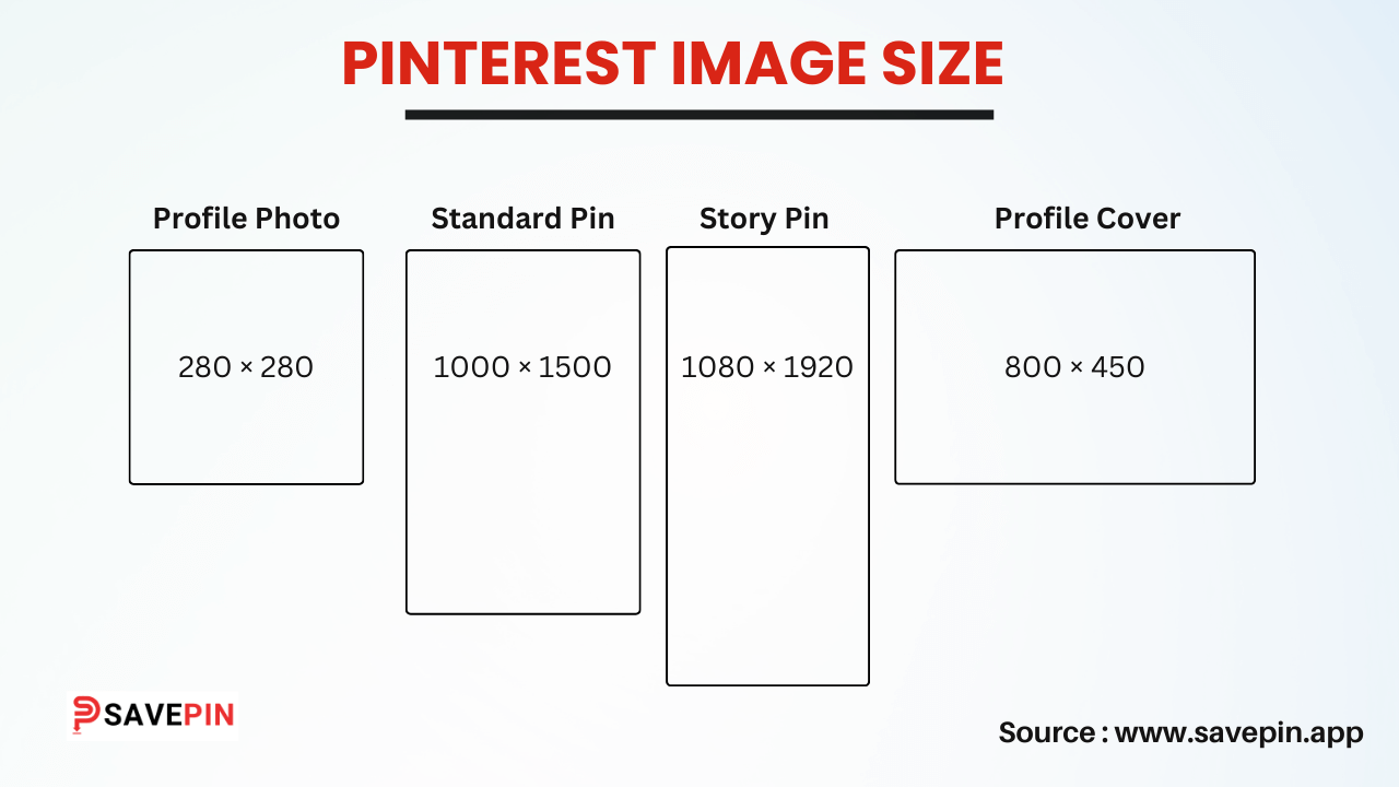
Pin Image Dimensions:
- For standard pins, the optimal dimensions are 1000 x 1500 pixels. This vertical format maximizes visibility in the Pinterest feed.
- For square pins, 1000 x 1000 pixels work well, but you can choose others depending on the image content.
- For promotional content, use the standard pin size of 1000 x 1500 pixels. Like the vertical format above, this ensures your image stands out on your users’ feeds while also maintaining a consistent look.
⚡️Descriptive titles are crucial for discoverability. Pinterest's search algorithm often relies on text. Craft clear and compelling titles with keywords for your pins. Utilize rich pins for automatic updates like product prices.
Board Cover
Board covers are displayed as 800 x 450 pixels. Anything bigger or smaller could impact how your image turns up across multiple seeds.
Profile Image
Maintain a square profile image with dimensions of 165 x 165 pixels.
Best Practices for Social Media Assets
Now that we’ve set up a solid foundation for your social media visuals, let’s dive into the details that make them truly effective.
Consistency in Branding
Branding isn’t just about logos, it’s about making your brand instantly recognizable. Keep your colors, fonts, and logos consistent across all platforms. Whether it’s your signature red or a calming shade of blue, make sure it shows up consistently in your visuals. Every post should reinforce your brand’s identity at a glance.
Optimizing for Mobile Viewing
Social media is a mobile-first world, and your content needs to match. Think about how people scroll, fast, distracted, and on small screens. Your images, videos, and text should be sharp, easy to read, and formatted for mobile. Treat your content like a pocket-sized masterpiece that grabs attention instantly.
Creating Engagement-Focused Content
Your content should spark conversations, not just sit there. Ask questions, start challenges, and create posts that encourage likes, shares, and comments. Don’t just post and hope for the best, add clear calls-to-action (CTAs) so people know what to do next. Whether it’s clicking a link, signing up, or dropping a comment, make engagement effortless.
Making Content Accessible and Inclusive
Social media should be easy for everyone to enjoy. Use alt text for images so visually impaired users can understand your content. Add subtitles to videos—not just for accessibility but because many people watch without sound. A little effort in inclusivity goes a long way in expanding your audience.
Adapting to Platform Trends
Trends shift fast, and what works on Instagram might flop on LinkedIn. Stay updated on platform-specific trends, are carousel posts dominating? Are long-form videos picking up steam? Follow platform shifts and tailor your content accordingly.
Tools & Resources for Social Media Assets
The right tools can make content creation smoother. Here are some must-haves:
Synup Social : A comprehensive social media management platform that lets you schedule posts, track engagement, and analyze performance, all from a single dashboard. Perfect for businesses looking to streamline their social media efforts while keeping everything on-brand.
Hootsuite : A powerhouse for social media scheduling, monitoring, and engagement. It allows you to manage multiple accounts, analyze performance, and keep track of conversations in one place.
Statusbrew : A multi-platform content planner that makes collaboration easy. With features like approval workflows and in-depth analytics, it’s great for teams managing content across different channels.
Lightroom: A professional-grade photo editing tool that enhances visuals with advanced features like color correction, presets, and AI-powered adjustments to make your images stand out.
Headliner: Ideal for creating short, engaging audio and video snippets. Whether you’re promoting a podcast or adding captions to your videos, it helps grab attention quickly.
Google Trends: A great tool for content ideation. It helps identify trending topics so you can create timely and relevant social media posts that resonate with your audience.
Lumen5: Converts blog posts into engaging videos with AI-powered editing. It’s a great way to repurpose written content into visual storytelling for social platforms.
Canva: A go-to design tool for creating stunning social media graphics. With easy drag-and-drop features and customizable templates, anyone can design eye-catching posts.
FlexClip: A user-friendly AI video editor that helps create professional-quality videos without requiring technical expertise. Great for social media clips, ads, and promos.
All Hashtags: Helps you find the best hashtags to increase reach and discoverability. It suggests relevant, trending hashtags to improve your content’s performance.
Brandwatch: A social listening tool that tracks brand mentions, audience sentiment, and industry trends. It provides deep insights into how people perceive your brand online.
Social Media Image Sizes - The Complete Guide: FAQs
4:3 or 16:9 for social media?
- 16:9 works better for platforms like YouTube, LinkedIn, and Twitter, but for feed posts, square (1:1) or vertical (4:5, 9:16) formats tend to perform better. 4:3 isn’t as common.
What social media size is 1080x1920?
- That’s a 9:16 vertical format, perfect for Instagram Stories, Reels, TikTok, YouTube Shorts, and Facebook Stories.
What pixel size is 4x5 for social media?
- 1080x1350 pixels, mostly used for Instagram and Facebook feed posts since it takes up more screen space.
What size is a social media OG image?
- Typically 1200x630 pixels (1.91:1 ratio) this is what shows up when you share a link on Facebook, LinkedIn, or Twitter.