How to Get Started Designing Stunning Social Media Graphics
Unleash your creativity with this guide on designing stunning social media graphics. Learn the basics & elevate your brand's visual presence today!
It’s a well-known truth that users of social media are more inclined to pay attention to high-quality graphics on posts, which boosts engagement, and can improve overall online brand reputation.
Accurately portraying a product or service through high-quality images has been known to increase sales and even customer satisfaction (“This product looks just like it was advertised as!”). Impressive graphics are more likely to be shared and thus increase your reach on social media, as well. Exceptional visuals can help a company stand out from the competition and can tell a story about a brand that draws users and potential customers to its profiles.
So what’s the secret sauce to designing social media graphics? We have some tips and tools to help your brand without breaking the bank.
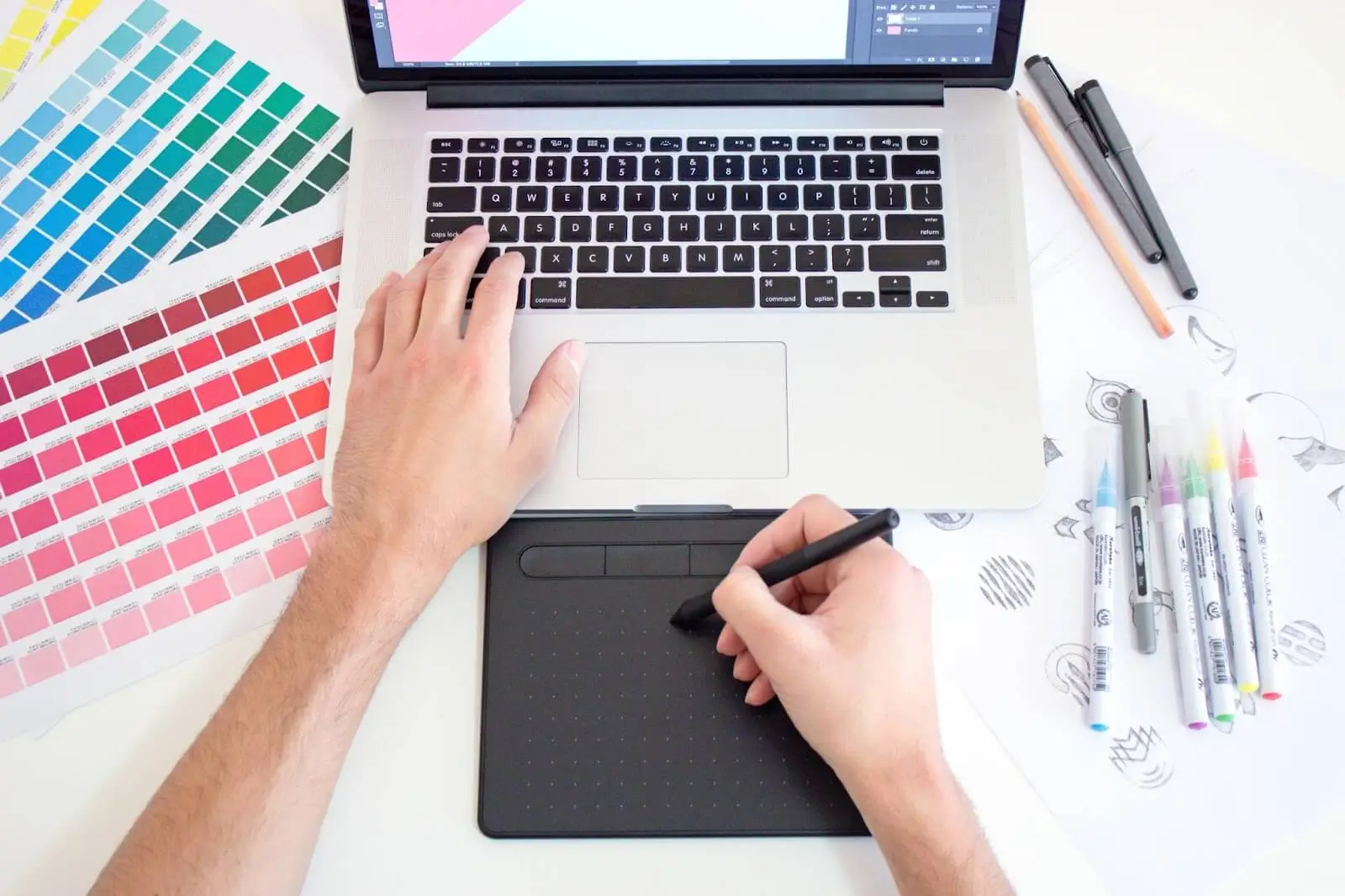
Photo courtesy of Theme Photos
Before you even get started, make sure you know what the height and length, as well as file size of your graphic should be. Different social media platforms have different size requirements for graphics, so make sure you create your graphic at the correct size.
- For example, the ideal dimensions for a Facebook cover photo are 820 by 312 pixels, whereas the ideal dimensions for a Twitter header image are 1500 by 500 pixels.
- Large files may take longer to load and may interfere with some devices. File sizes should be kept as small as feasible without sacrificing quality.
- The width to height ratio of a graphic is referred to as the aspect ratio. Some social networking platforms advise using certain aspect ratios. A Facebook cover photo, for instance, has an aspect ratio of 2.63:1. When cropping or scaling a visual, it's crucial to keep the same aspect ratio.
- High-quality visuals are preferred because low-quality ones can present as grainy and difficult to read.
- Take into consideration that the majority of users visit social media from mobile devices, so make sure the graphic is clear and readable on smaller displays.
- The graphic's intended use should also be taken into account. An image that will serve as a background, for instance, can be bigger than an image that would serve as a profile photo.
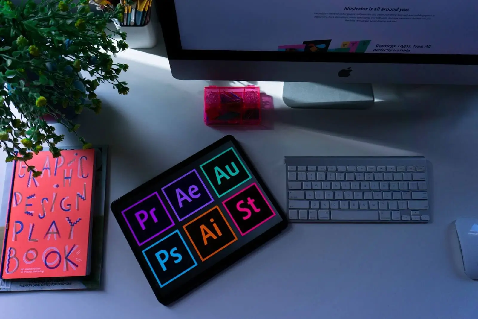
Photo courtesy of Emily Bernal
Use a graphic design tool. Online design tools have pre-designed templates and a wide range of customizable design elements that you can use to create professional-looking graphics. We’ve got a few to recommend:
- Canva is an easy-to-use visual design tool with a great freemium option that has a huge selection of templates and creative components. It's excellent for making flyers, posters, and other graphics for social media.
- Another user-friendly design tool with a large selection of templates and design elements is Adobe Spark. It's excellent for producing graphics, posts, stories, movies, and other things for social media.
- GIMP is A free, open-source image editing tool with many of the same features as Adobe Photoshop, GIMP is widely available for download. It works well for photo editing and retouching.
- Inkscape is another free, open-source vector graphics editor that is comparable to Adobe Illustrator. It works well for producing vector-based visuals such as logos and illustrations.
- Vectr, is free and simple to use in producing vector graphics. Simple drawings and icons can be easily made with it.
- Pixlr is an online photo editor with a large selection of editing features. It's excellent for simple photo retouching and editing. Oh, did we mention that’s free, too?
- A free online photo editor called Fotor offers a variety of editing tools, presets, and effects. It works well for photo editing, collage making, and designing social media visuals.
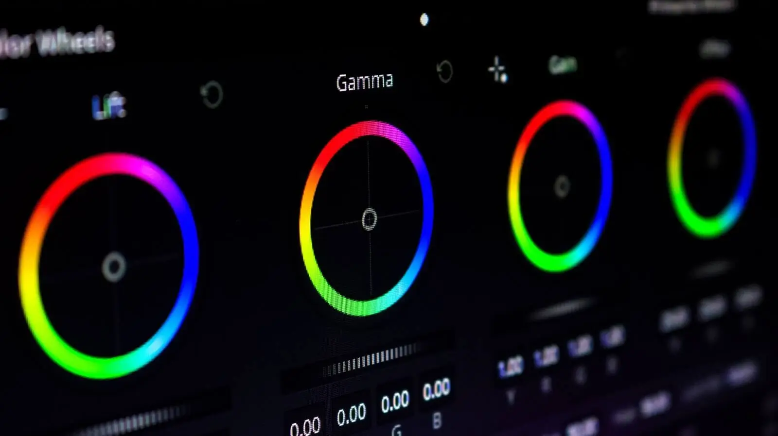
Photo courtesy of Setyaki Irham
Select an eye-catching color scheme. Choose a few colors that complement each other and use them consistently throughout your graphic to create a cohesive look. The sort of content and general look of the brand or company will determine the ideal color schemes for social media. However, the following are a few color scheme possibilities that are well-known to work and are frequently used on social media:
- A monochromatic color scheme makes use of several tints and tones of a single color. This can produce a polished and coordinated appearance.
- Two colors that are next to each other on the color wheel are used in a complementary color scheme. This may produce an appearance with strong contrast and visual appeal.
- A similar color scheme makes use of three hues that are adjacent to one another on the color wheel. This may produce a unified and balanced appearance.
- Three colors evenly spaced out around the color wheel are a triadic color scheme. This may produce a vibrant and captivating appearance.
- A gradual transition between two or more hues is used in gradient color schemes. This could produce a sleek, contemporary appearance.
- The color scheme you select should also be readable on a variety of screens and backdrops, particularly when it comes to writing and typography.
It's crucial to bear in mind that audience, culture and context can have an impact on color selections, and it's always a good idea to test and evaluate the effects of various color schemes. The color scheme of the brand should also be taken into account because it should be consistent and complement the business's identity.

Photo courtesy of Divyangi K
Choose images that are clear and visually appealing. You can find free stock images on websites like Pexels or Unsplash. If an image satisfies certain technical and aesthetic requirements, it is said to be of high quality. A few elements that affect an image's quality are listed below:
- The amount of pixels in an image is referred to as its resolution. When seen at a bigger size, a high resolution image will appear sharper and more clear since it contains more pixels.
- How distinct and distinct the details in an image are is referred to as sharpness. Sharp edges and distinct details characterize an image of excellent quality.
- Exposure is a term used to describe an image's lighting. An image of high quality will have a balanced distribution of light and dark areas, as well as good exposure.
- Accurate and vivid colors are a sign of a high-quality photograph. The image's subject should be consistently represented by the colors.
- The arrangement of the elements of an image is referred to as composition. A picture of excellent quality will have a beautiful and balanced arrangement of the elements and good composition.
- Noise is an unwelcome grainy texture that appears in images; it is typically brought on by high ISO settings or dim lighting. Noise will be low in an image of good quality.
- A well-cropped image of excellent quality will have the main subject in focus and any extraneous components clipped out.
- The format of an image affects its quality, as well. JPEGs are the most widely used format for images and are great for most scenarios, although formats like TIFF or PNG are better choices for specific applications like print or large projections.
- Keep it simple. Don't overcrowd your graphic with too much text or too many design elements. Use white space effectively to create a clean and uncluttered look.

Photo courtesy of Brett Jordan
Use typography to your advantage. Choose fonts that are easy to read and that match the tone of your message. Mix and match font styles to create visual interest. The sort of project and the overall look and feel of the design will choose the ideal typefaces for graphic design. However, the following are a few choices that are well-known to work and are frequently used in graphic design:
- Sans-serif fonts: Because they are crisp and contemporary, sans-serif fonts are excellent for use in digital design. Helvetica, Open Sans, and Arial are a few common sans-serif font choices.
- Serif fonts: Serif fonts contain little flourishes or lines at the end of the strokes, which can give a design a sense of beauty. Georgia, Garamond, and Times New Roman are a few common serif font choices.
- Script typefaces can give a design a more unique vibe by giving it a more natural, handwritten feel. The scripts Brush Script, Pacifico, and Lucida Handwriting are among the more well-liked choices.
- Display typefaces: Because they are large and striking, display fonts are ideal for headings and titles. Futura, Rockwell, and Baskerville are a few common display alternatives.
- Monospace fonts: Because each character in a monospace font is the same width, they are excellent for coding and programming. Courier, Consolas, and Monaco are a few of the well-liked monospace alternatives.
When choosing a typeface, keep in mind that it should be easy to read on a variety of screens and backdrops, especially for text and typography. Additionally, take into account the context and message that should be communicated through the design, as the font selection can significantly affect the design's overall tone.

Photo courtesy of Austin Distel
Finally, before you post your graphic on social media, preview it to make sure it looks good on different devices. There are some platforms that let you test the graphic in a simulated view before posting. Other times you may want to check on yours or other’s devices to see how it looks.
—
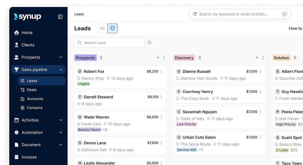
Curious about a platform where you can post visually stunning graphics across all your social media profiles with one click? Synup is offering a free trial today to help your company reach more customers by uniting your social profiles on one platform. Start a conversation with us to find out how we’re making this process stress-free with maximized results.
Follow us on Facebook, Twitter, LinkedIn or Instagram to hear more from us.